Power BI Basics
Visualization
There are three main sections in Power BI they are Report View, Data View, and Model View.

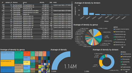
In the Report View visualizations are created. These visualizations can be anything from Tables, Graphs, Charts, Gauges, and many others.
Python and R code can be used to generate a visualization.
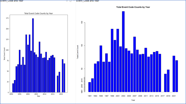
Python Visualization Script
# Import the necessary libaries
import pandas as pd
import matplotlib.pyplot as plt

# Assuming you already have the 'dataset' data frame with 'Event_Code' and 'Year' Columns
# Group the data by 'Year and calculate the sum of counts for all Event Codes within each year

event_sums - dataset.groupby('Year')['Event_Code'].count().reset_index()

# Rename the columns for clarity
event_sums.columns = ["Year", "Total_Event_Count"]

# Create a bar plot for the total count of Event Codes by year
plt.bar(event_sums['Year'], event_sums['Total_Event_Count'], color='blue', edgecolor='black')
plt.title("Total Event Count by Year")
plt.xlabel("Year")
plt.ylabel("Total Event Count")

# Display the plot
plt.show()
R Visualization Script
# Assuming you already have the 'dataset' data frame with 'Event_Code' and 'Year' Columns
# Group the data by 'Year and calculate the sum of counts for all Event Codes within each year

event_sums <- aggregate(Event_Code ~ Year, dataset, FUN = length)

# Create a sequence of all years from the minimum to maximum year in your dataset

all_years <- min(event_sums$Year):max(event_sums$Year)
event_sums <- merge(data.frame(Year = all_years), event_sums, all.x = TRUE)
event_sums$Event_Code[is.na(event_sums$Event_Code)] <- 0
colnames(event_sums) <- c("Year", "Total_Event_Count")

# Create a bar plot for the total count of Event Codes by year
barplot(event_sums$Total_Event_Count, names.arg = event_sums$Year,
        main = "Total Event Count by Year", xlab = "Year", ylab = "Total Event Count",
        col = "blue", border = "black")

# Add custom tick marks to x-axis
axis(2, at = 1:length(event_sums$Year), labels = event_sums$Year, tick = TRUE)
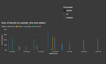
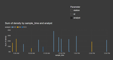
Visualization by Parameter We can create a parameter to chart data:
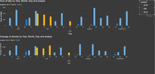
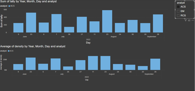
Visualization by Slicer Or we can use a slicer to filter the data:
Data View
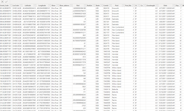
This is where all the data can be viewed in a table/excel like format.
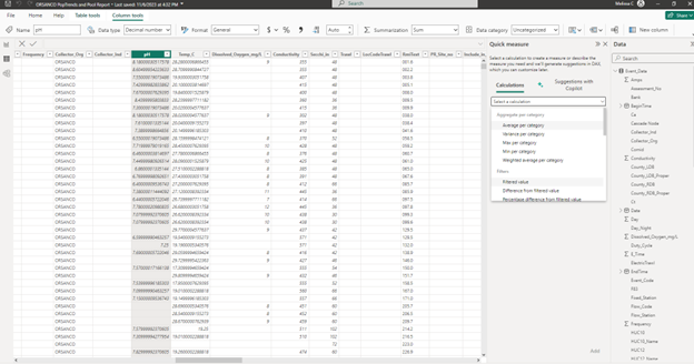
Add a quick measure to add a column to the table with common features in categories such as aggregation, filters, time, totals, mathematical operations, or text.
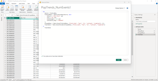
Create a new table based on a query in Dax or M. This example is in M.
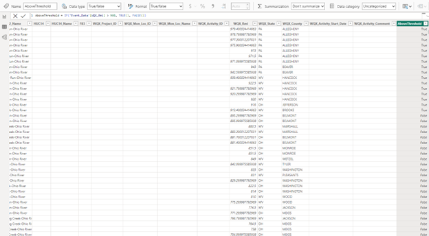
Create a more complicated equations this one is in Dax.
Model View
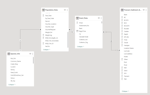
Model view is where we can view the tables and the connections that they have with each other in an ERD style format. If you need to join two tables that are not currently joined, then this is where you can do that in Power BI.
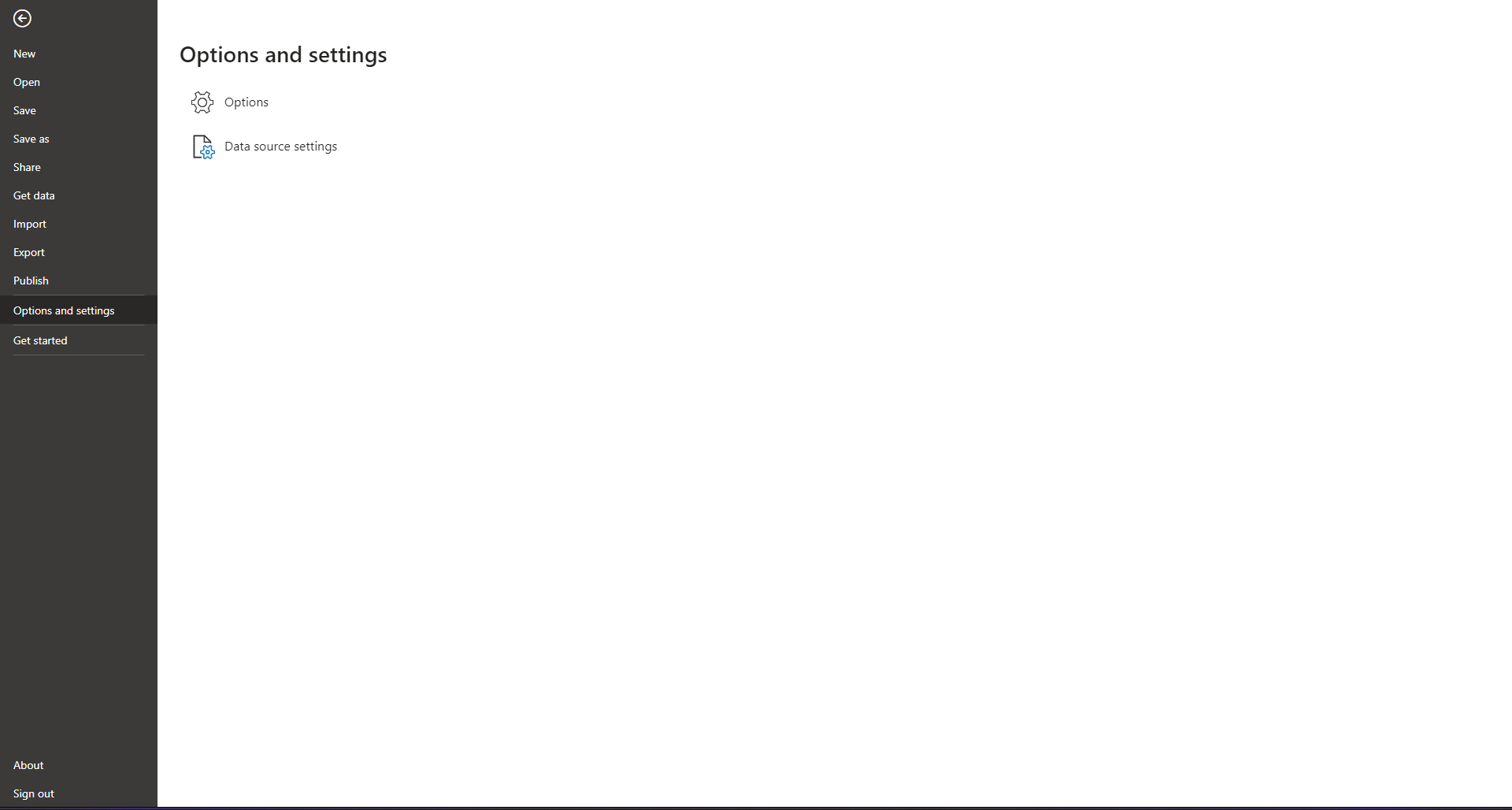
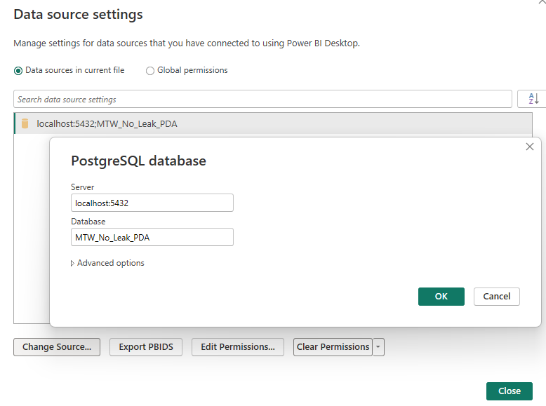
Changing the Data Source
In order to change the Data Source
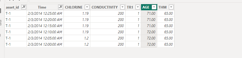
Issues with rounding when importing data in Power BI